Graphics Interpretation, often abbreviated as GI, is one of the most visual and practical question types on the GMAT. In a typical GI question, you are presented with information shown through charts, graphs, plots, or diagrams. Your task is to read the visual carefully, understand what the data represents, and select the correct responses based on what the graphic shows. Through this format, the GMAT evaluates how clearly you read visual data, how well you connect numbers to meaning, and how carefully you avoid misinterpreting what the graphic actually conveys. These questions often require more than one selection, and the question is marked correct only when all required responses are accurate. Within the 20 questions that make up the Data Insights section of the GMAT, about 3 to 4 questions are Graphics Interpretation, making thorough coverage of GI an essential part of a dependable GMAT prep course.
On this page, we present a collection of sample graphics interpretation questions that give you first hand exposure to how concepts are tested through the GI question type on the GMAT. As you work through these questions, without worrying about speed, focus on understanding the question format, the way information is presented, the nature and texture of the questions, the user interface, and the reasoning approach required for correct responses. Use this resource thoughtfully and carry the learnings into subsequent GMAT quizzes, GMAT sectional tests, and GMAT full-length mocks. Happy practicing!
Important: Before visiting the Graphics Interpretation sample questions, if you would like a quick brush up of key GI concepts, you may first visit: Free GMAT Graphics Interpretation Prep
GI Sample Question 1
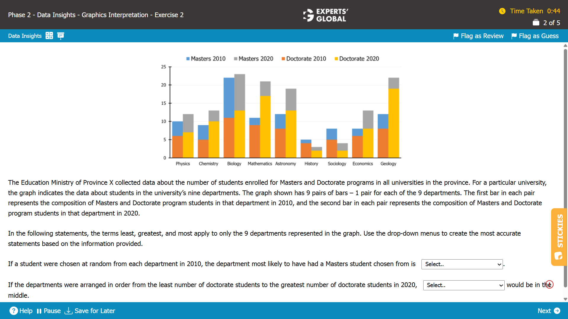
I.
From the graph, we see that for the Biology department in the year 2010, the number of Masters students is about the same as that of Doctorate students.
This implies that if a student were randomly chosen from the biology department in 2010, then the chances of the student being a Masters student would be around 50%.
For all the remaining departments in 2010, the number of Doctorate students is more than the number of Masters students implying that the chances of the student being a Masters student would be less than 50%.
Hence, Biology is the correct answer choice.
II.
The set of all departments arranged in order from the least number of doctorate students to the greatest number of doctorate students in 2020 is given by:
(History, Sociology, Physics, Economics, Chemistry, Biology, Astronomy, Mathematics, Geology)
Hence, Chemistry is the correct answer choice.
GI Sample Question 2
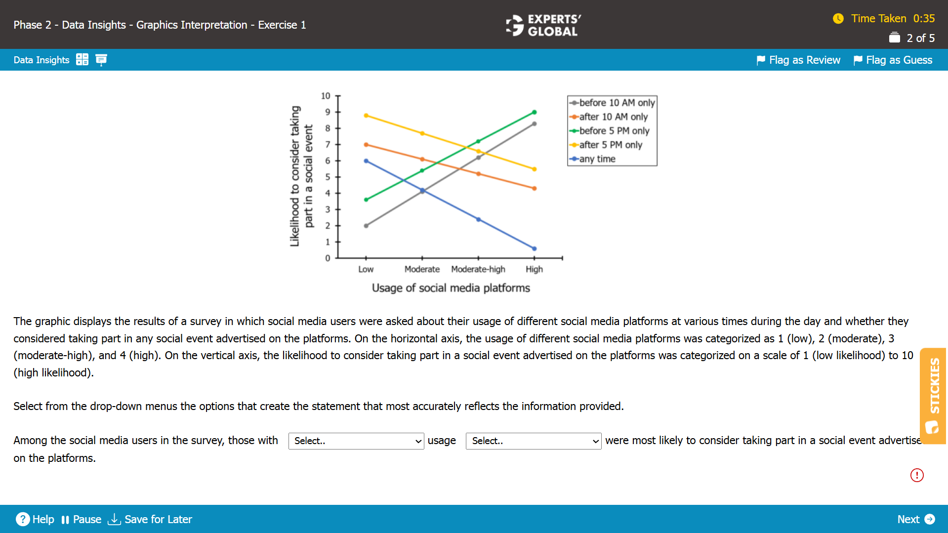
The vertical axis denotes the likelihood of considering taking part in a social event advertised on the platforms.
Since, we need to find the group that was most likely to consider taking part in a social event advertised on the platforms, we need to look for the data point that has the highest value along the vertical axis.
From the graph, we see that the data point corresponding to either “low usage of social media platforms after 5 PM only” or “high usage of social media platforms before 5 PM only” has the highest value along the vertical axis.
Since, low usage is not provided as one of the options for the first blank, the highest value along the vertical axis must be for the data point with high usage of social media platforms before 5 PM only.
Hence, “high” and “before 5 PM only” is the correct set of answer choices.
GI Sample Question 3
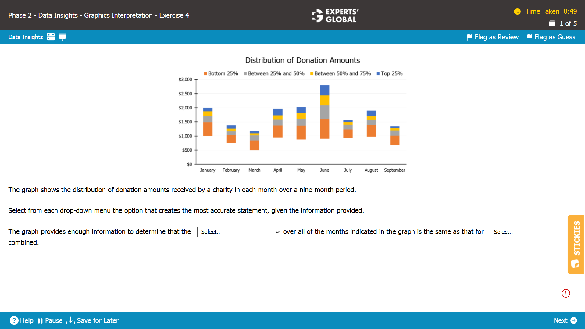
Range = Highest value – Lowest value
From the graph, we see that the month of March has the lowest donation amount. Also, the month of June has the highest donation amount.
Thus, the range of donation amounts over all of the months indicated in the graph is the same as that for the month of March and June combined.
Hence, the range of donation amounts and March and June is the correct set of answer choice.
GI Sample Question 4
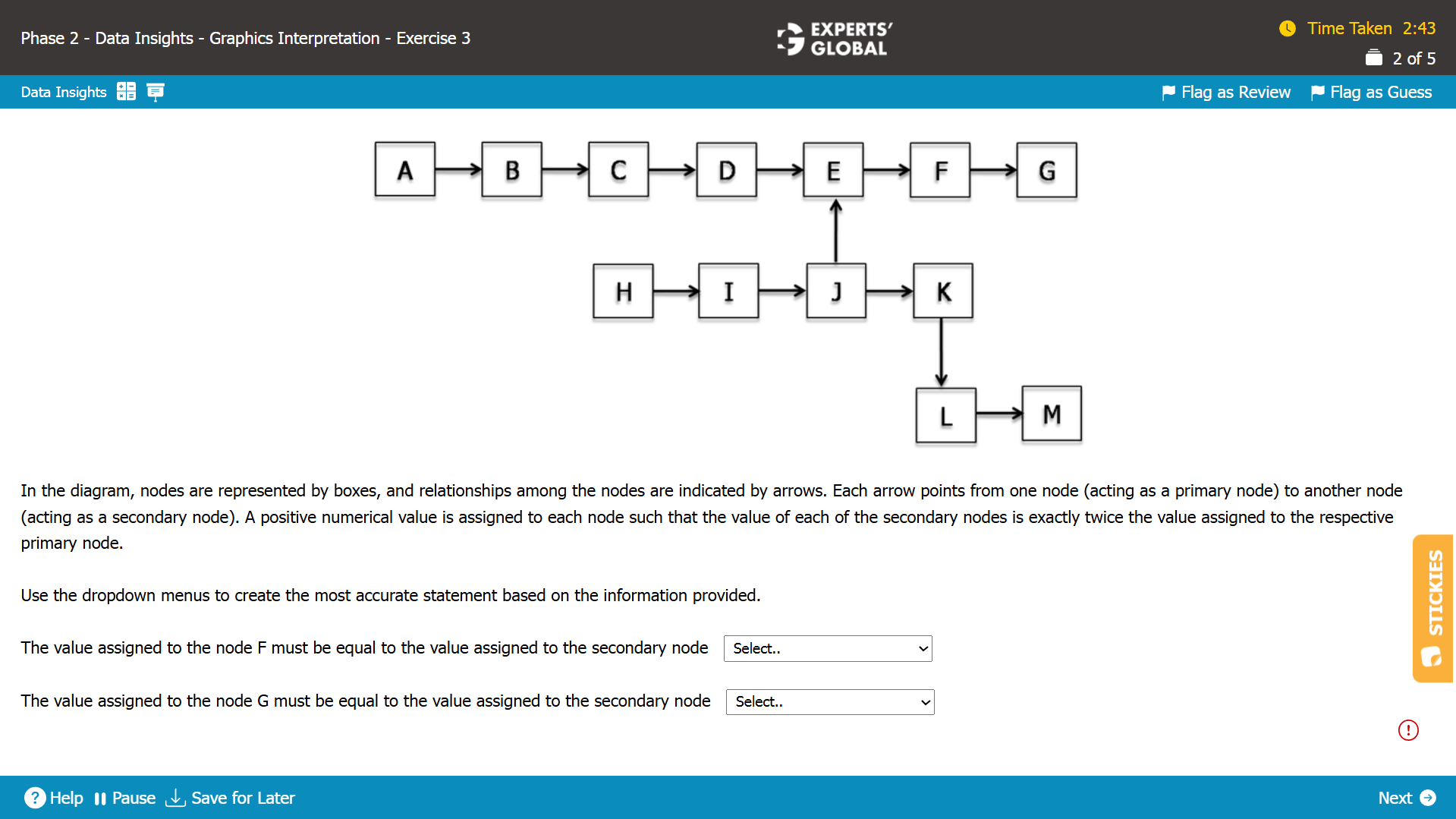
I.
D = F/4
E = F/2
G = 2*F
I = E/4 = F/8
L = 4*J
J = F/4
So, L = F
Hence,L the correct answer choice.
II.
A = G/2
6
B = G/2
5
H = G/2
5
L = 4*J
J = G/8
L = G/2
M = 8*J
J = G/8
M = G
Hence, M is the correct answer choice.
Need a comprehensive strategy, approach, and practice for Data Insights questions? Please
click here (you need to be enrolled for a course that includes the DI section).
GI Sample Question 5
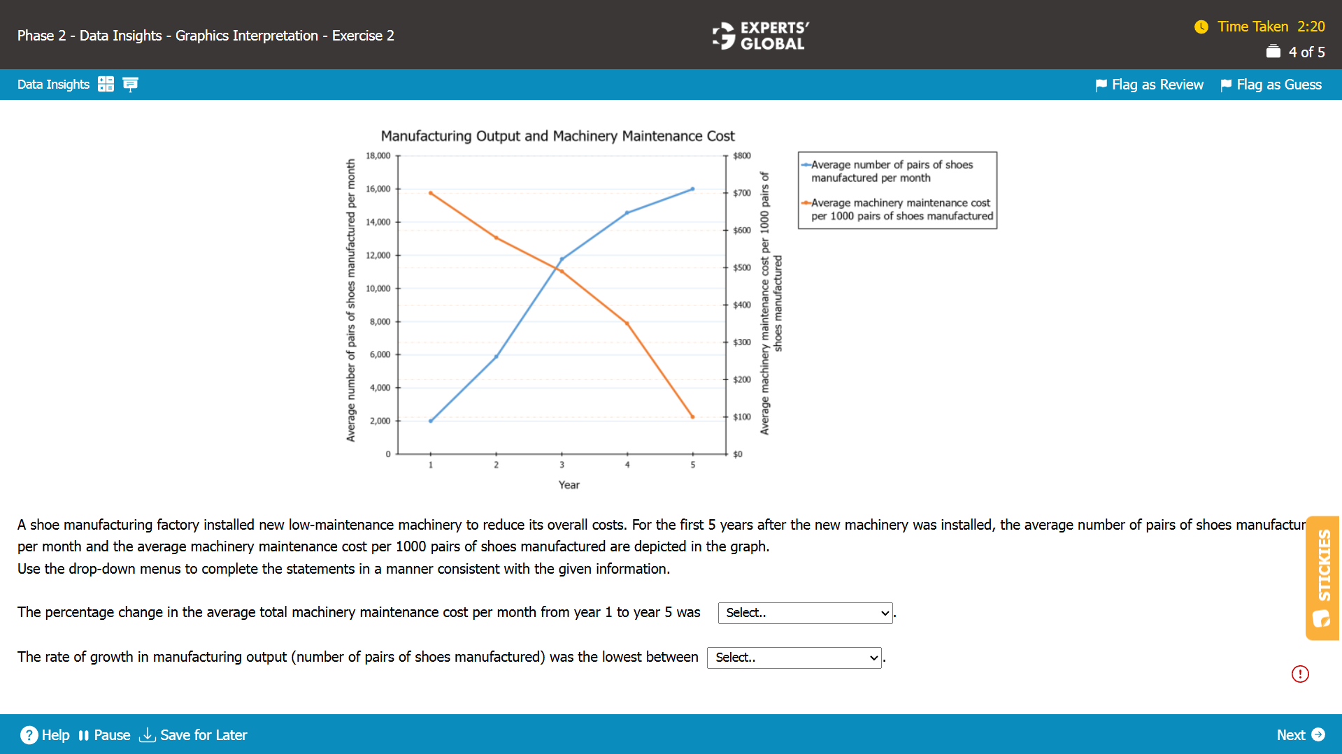
I.
The average number of pairs of shoes manufactured per month during year 1 = 2,000
Average machinery maintenance cost per 1000 pairs of shoes manufactured during year 1 = $700
Average machinery maintenance cost per pair of shoes manufactured during year 1 = $( 700 / 1,000 )
Average machinery maintenance cost per month (for 2,000 shoes) during year 1 = 2,000 × $( 700 / 1,000 ) = $1,400
The average number of pairs of shoes manufactured per month during year 5 = 16,000
Average machinery maintenance cost per 1000 pairs of shoes manufactured during year 5 = $100
Average machinery maintenance cost per pair of shoes manufactured during year 5 = $( 100 / 1,000 )
Average machinery maintenance cost per month (for 16,000 shoes) during year 5 = 16,000 × $( 100 / 1,000 ) = $1,600
Percentage change in the average machinery maintenance cost per day from year 1 to year 5
= (1,600 – 1,400) / 1,400
= 200 / 1,400
= 14%
Hence, an increase of 14% is the correct answer choice.
II.
To find the lowest rate of growth of manufacturing output look for the blue line that has the least steepness.
Hence, between year 4 and year 5 is the correct answer choice.
For Further Prep and Practice:
15 full-length GMAT practice tests (includes a free test)
End-to-end GMAT prep course online (includes 7-day free trial)
GMAT 5-weeks crash course
GMAT Prep + Admission Consulting Bundle

