Invest 30 seconds...
...for what may lead to a life altering association!
Help Line
- +91.8800.2828.00 (IND)
- 1030-1830 Hrs IST, Mon-Sat
- support@expertsglobal.com
...for what may lead to a life altering association!
33% off ends soon:GMAT/GRE prep + applications bundle. Profile building, longer mentoring, better results. Inquire


For overlapping sets on the GMAT, Venn diagrams work best when the groups are few in number and clearly defined, such as two or three sets with counts or percentages that must be combined or separated. Line diagrams are better when the overlap is driven by ranges, thresholds, or ordered values, such as people or items falling into partially overlapping score bands or time intervals. Due coverage of both these tools is an important part of any prominent GMAT prep course. On this page, we aim to give you a clear, practical answer on when to use a Venn diagram and when to use a line diagram for overlapping sets so that you can choose the right tool from your arsenal and solve GMAT questions efficiently and calmly in the exam setting.

The choice between a Venn diagram and a line diagram becomes much easier once you understand the type of information each was created to hold. A Venn diagram is a natural fit when the data is divided into categories or types. Whereas, a line diagram is more suitable when the information sits on a numerical range. Students often feel overwhelmed when they rely on intuition alone, but these two forms give the mind a place to rest. They help you see the story inside the numbers.

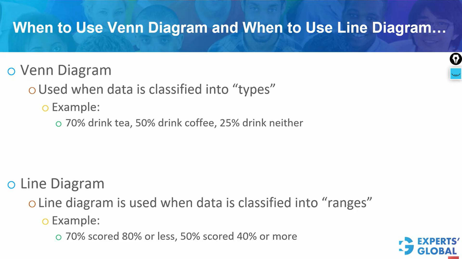
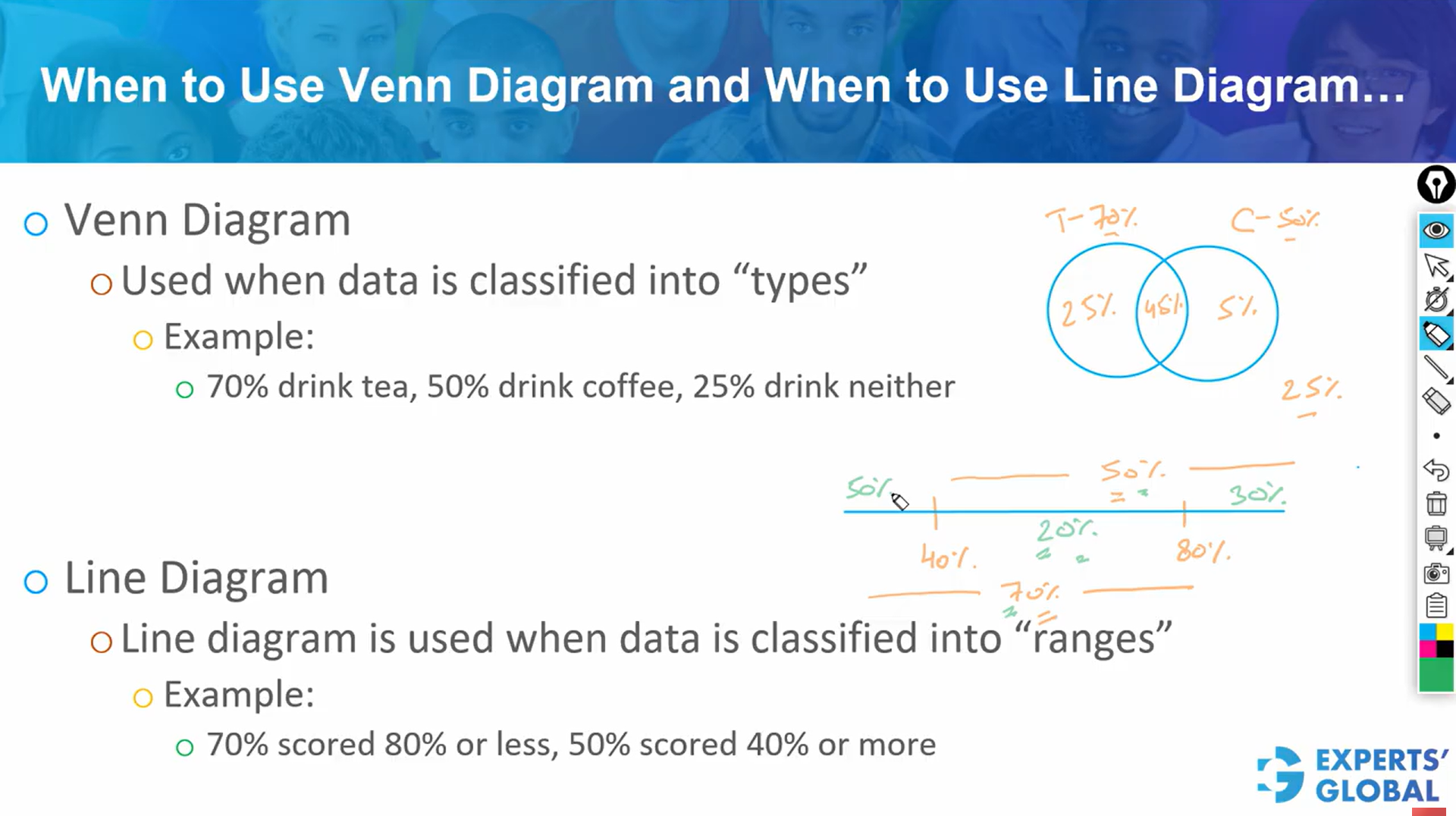
Consider a situation in which a survey reports that 70 percent of the participants like tea, 50 percent like coffee, and 25 percent like neither. At first, these numbers can feel scattered. The moment you begin arranging them inside a Venn diagram, however, the picture becomes clear. The sum of the three values, 70 plus 50 plus 25, gives 145. This extra 45 percent must represent the double counted overlap. That is the part of the group that appears in both the tea circle and the coffee circle.
Once you know that the overlap is 45 percent, placing the rest becomes simple. If neither is 25 percent, then the remaining 75 percent of the population sits inside the two circles. From that 75 percent, you assign 45 percent to the intersection. The remaining 30 percent must be split between tea only and coffee only based on their totals. Tea has a reported total of 70 percent, so tea only must hold 70 minus 45, which is 25. Coffee has a reported total of 50 percent, so coffee only must hold 50 minus 45, which is 5. With these values placed correctly, the entire diagram now adds to 100 percent. Every segment has meaning, and every part of the group is accounted for. Once the diagram is complete, every question that follows becomes easier because your mind no longer has to imagine the structure. It can simply read it.
Now consider a second situation. A class reports that 70 percent of the students scored 80 percent or lower on a test, and 50 percent scored above 40 percent. These statements no longer describe types of people. They describe ranges on a scale. This change in the nature of the data makes a Venn diagram inappropriate, and a line diagram becomes the right tool.
Place a single line that represents scores from 0 to 100. On this line, mark the two ranges mentioned. One range represents those who scored 80 or lower, which covers the entire left portion of the line. The other range represents those who scored above 40, which covers the right portion. When you add the two percentages, 70 plus 50, you get 120. The extra 20 percent must represent the double counted overlap, the portion of the population that lies in both ranges. That overlap corresponds to scores between 40 and 80.
Once the 20 percent overlap is clear, partitioning the line becomes natural. Out of the 50 percent who scored above 40, subtract the 20 percent who lie in the overlap. The remaining 30 percent must represent those who scored strictly above 80. Out of the 70 percent who scored 80 or lower, subtract the same 20 percent. The remaining 50 percent must represent those who scored 40 or lower. These three segments, 50 percent, 20 percent, and 30 percent, now form a complete and meaningful picture. Each part of the line adds to 100 percent, completing the diagram.

Use Venn diagrams when information is divided into types, and line diagrams when information is given across score ranges. Learn to calculate overlaps, complete each diagram to one hundred percent, and read every region as a precise share of the group through GMAT simulations, so that overlapping sets questions gradually feel structured, calm, and manageable across your long preparation journey. These habits strengthen quantitative reasoning, support clear decision making, and carry into case discussions, projects, and professional analysis.
Every diagram you draw is a small reminder that clarity grows when you slow down and let structure guide your thinking. This habit shapes far more than your GMAT preparation. It nurtures the patience needed in MBA applications, where thoughtful choices matter, and strengthens the calm reasoning you will rely on throughout your studies and career. When you practice with each GMAT mock, you are not only solving problems. You are learning to see patterns, to honor quiet discipline, and to trust the steady perspective that carries you through complex decisions in work and in life.