
Invest 30 seconds...
...for what may lead to a life altering association!
Help Line
- +91.8800.2828.00 (IND)
- 1030-1830 Hrs IST, Mon-Sat
- support@expertsglobal.com
33% off ends soon:GMAT/GRE prep + applications bundle. Profile building, longer mentoring, better results. Inquire
A line diagram is a simple number line that shows how ranges overlap, separate, or combine, making it an excellent tool for solving GMAT Problem Solving questions on overlapping sets and an essential idea in a dependable GMAT preparation course. It turns complex verbal descriptions into a clear visual layout, helps you mark boundaries with precision, and allows you to read each segment as a portion of the whole. On this page, a detailed conceptual video, along with supporting explanations, introduces you to the use of line diagrams for overlapping sets on the GMAT and walks you through word problems and other illustrative examples. All of this guides you toward an efficient, steady approach that works well under exam and time pressure.

There is something deeply reassuring about seeing a complex idea turn into a single clean line. Line diagrams offer exactly that comfort. They are used when data is organised by ranges rather than by types. In these situations, the number line becomes your entire universe. Every segment along it carries meaning, and together those segments account for one hundred percent of the group you are studying. Once you understand how the line breathes and shifts with each condition, the entire topic begins to feel grounded and human.
A line diagram is chosen when the information talks about values being greater than, less than, or between certain numbers. These comparisons define ranges. A conventional Venn diagram does not help here because Venn diagrams compare types, while line diagrams compare intervals. Once you sense this difference, you start reading questions with new gentleness. You stop looking for circles and begin looking for stretches.
Consider the following complete question.
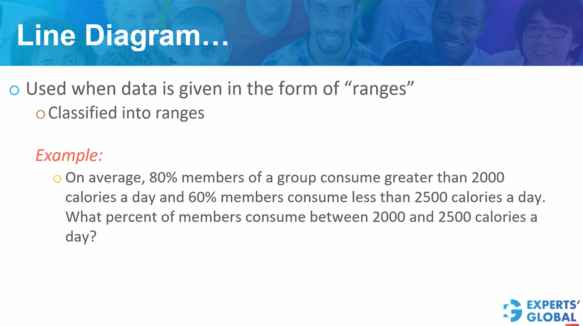
In a group, 80 percent of members consume more than 2000 calories per day, and 60 percent consume less than 2500 calories per day. What percent of members consume between 2000 and 2500 calories per day?
To approach this, imagine your entire universe drawn as a straight line. This line represents one hundred percent of the members. The only numbers mentioned are 2000 and 2500, so those are the only points you place on the line.
Next, the statement “80 percent consume more than 2000 calories” means that the region from 2000 up to the end of the line represents 80 percent of the group.
Similarly, “60 percent consume less than 2500 calories” means that the region from the beginning of the line up to 2500 represents 60 percent of the group.
The heart of a line diagram is always the overlapping region. Here, the overlap is the stretch between 2000 and 2500. It contains all members counted in both conditions. Its value comes from the relationship:
Overlap = 80 percent + 60 percent − 100 percent = 40 percent.
So 40 percent of the members lie between 2000 and 2500 calories. Once the overlap is known, the remaining parts follow naturally.
The region below 2000 becomes 60 percent minus 40 percent, which is 20 percent.
The region above 2500 becomes 80 percent minus 40 percent, which is 40 percent.
A quick check of 20, 40, and 40 shows they add to 100 percent, so the diagram is complete.
Now consider a second complete example, which you can work along with.
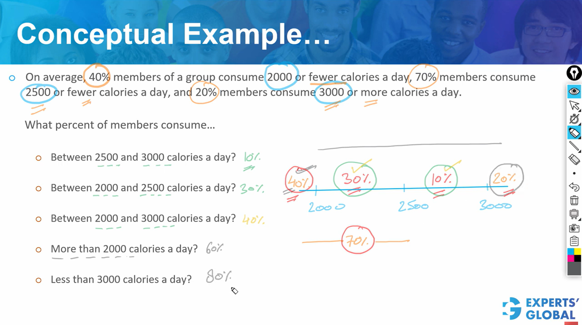
In a group, 40 percent consume less than 2000 calories, 20 percent consume more than 3000 calories, and 70 percent consume 2500 calories or fewer. Answer the following five questions:
Begin by placing all numbers mentioned on the line: 2000, 2500, and 3000. Everything on this line must total to one hundred percent.
The first condition says that 40 percent consume less than 2000. So the entire region to the left of 2000 becomes 40 percent.
The second condition says that 20 percent consume more than 3000. So the region beyond 3000 becomes 20 percent.
The third condition says that 70 percent consume 2500 calories or fewer. So the entire region to the left of 2500 carries 70 percent.
Once this raw information is placed, the inner structure becomes clearer.
The region between 2000 and 2500 must be 70 percent minus 40 percent, which is 30 percent.
Now, 40 + 30 + (region between 2500 and 3000) + 20 must equal 100. This tells us that the region between 2500 and 3000 is 10 percent.
With the full diagram complete, the questions follow easily:
These answers come peacefully once the line has revealed its structure.
This lesson shows how line diagram based sets convert range information into a single clear number line that represents the whole group. You learn to place key thresholds, compute overlapping regions, and treat each segment as a precise share of one hundred percent. Practicing these steps inside rigorous GMAT simulations turns percentage questions about ranges into quiet, methodical reasoning and builds habits of structured thinking that support word problems, data interpretation, and broader analytical work across the exam and beyond.
When you work with line diagrams, you practice the gentle art of seeing how a whole is shaped by its parts and how each segment carries its quiet share of meaning. This habit stays with you. It steadies your approach to every GMAT mock, where patient reasoning matters more than speed. It also shapes how you read people, choices, and circumstances in your MBA journey. Life often unfolds in ranges rather than fixed categories, and learning to notice those ranges with calm attention helps you make wiser decisions with a clearer sense of proportion and purpose.
