
Invest 30 seconds...
...for what may lead to a life altering association!
Help Line
- +91.8800.2828.00 (IND)
- 1030-1830 Hrs IST, Mon-Sat
- support@expertsglobal.com
33% off ends soon:GMAT/GRE prep + applications bundle. Profile building, longer mentoring, better results. Inquire
Although the GMAT has the Data Insights section for chart-based questions, including a specific Graphics Interpretation question type for such items, some graph and table based questions do appear in the GMAT Quantitative Problem Solving section as well. Graphs and table based questions in the GMAT Quant section are standard problem solving questions that test the same core skills as other problem solving items. The only difference is that the raw information is presented through charts or tables, such as bar graphs, line charts, pie charts, histograms, or simple data tables. The key to solving these questions lies in first understanding what overall data the chart or table represents, then clearly identifying what the question is asking, locating the specific data points required, and finally performing the necessary calculations to reach a unique answer. Out of the 21 problem solving questions in the GMAT Quant section, you can typically expect 1 or 2 to be based on graphs or tables, so thorough coverage of such questions should be an integral part of any trusted GMAT preparation course. On this page, we introduce you to such questions and help you develop a simple, organized approach for solving them efficiently on the GMAT.

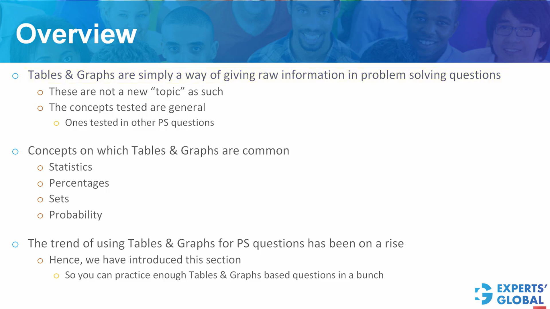
Students sometimes expect a new topic when they see a graph, yet every example reminds us that the concept is already known. A graph showing values across years may still be a statistics question. A chart comparing segments may still be a percentage question. A table may simply serve a probability, sets, or permutations question. Visual presentation is the only difference. Because of the rising frequency of these formats, it becomes helpful to practice them in a focused way and develop a clear approach for reading the information.
The method for solving tables and graphs based questions rests on four simple steps. These steps keep your mind calm, prevent unnecessary reading, and help you respect your time on the exam.
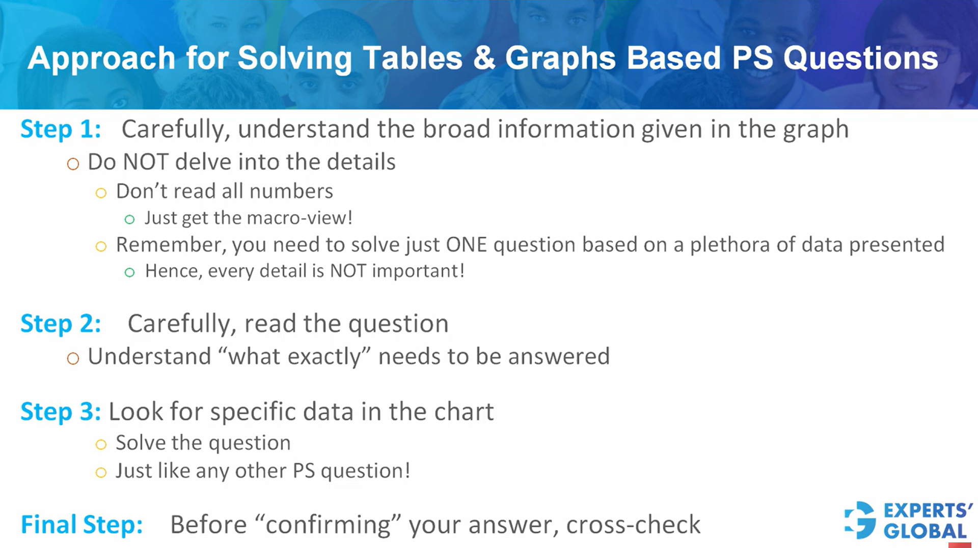
When you face a chart or graph, begin by understanding only the broad idea. In the question discussed, the graph placed population on the vertical axis and decades on the horizontal axis. At this stage, you do not need to read any numbers or dive into details. You only need a sense of what the graph represents. You are answering one question, not memorizing an entire dataset, so many details will not matter.
Next, identify exactly what the question asks. In the sample problem, the question was to determine the decade in which the population experienced the greatest percentage decrease. Naming the task clearly helps you avoid distractions and keeps your focus disciplined. Without this clarity, the data can feel overwhelming.
Once you know what you seek, go to the exact locations in the graph that hold the needed information. This is the moment the problem stops feeling like a chart question and becomes a regular problem solving question. You look at the declines, compare the base values, and compute percentage decrease rather than absolute decrease.
A brief pause to verify your work protects you from losing points to small errors. This habit becomes even more important when visuals are involved because a misplaced glance at a number can lead to an incorrect conclusion. A calm verification ensures accuracy.
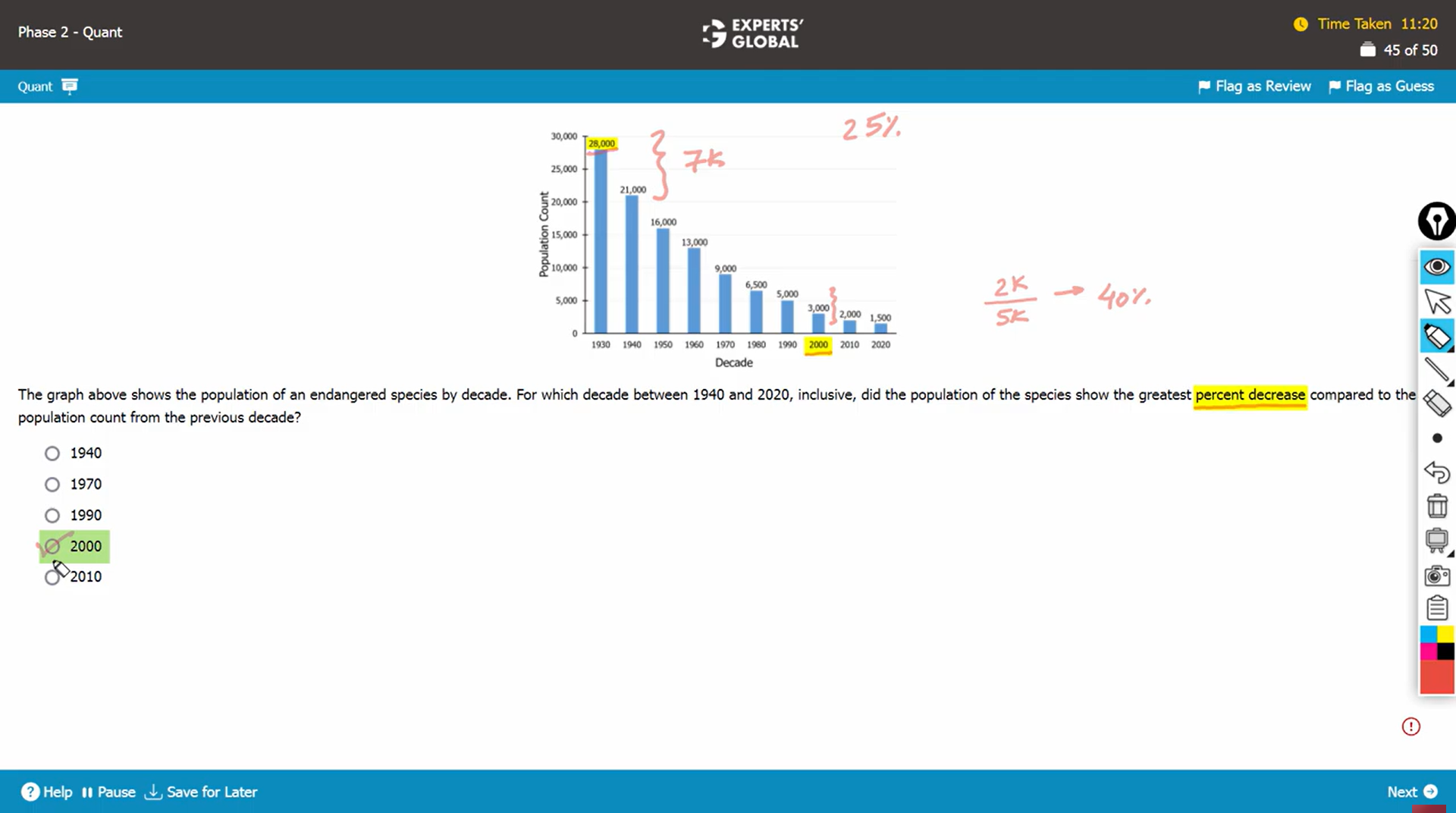
The question asked for the decade with the greatest percentage decrease in population. The graph showed one decline from 28,000 to 21,000. This was a drop of 7,000, but on a base of 28,000, it represented only a 25 percent decrease. Another decline showed a change from 5,000 to 3,000. This was a drop of only 2,000, yet on a base of 5,000, it represented a 40 percent decrease. Because the question required the largest percentage decrease, the correct decade was 2000. The correct answer choice was D.
The power of this example lies not in the calculations but in the approach. When the structure is clear, the work feels steady and manageable.
Tables and graphs reward a calm, methodical mind. They invite you to rise above the noise of scattered data and hold on to what truly matters. When you learn to understand the big picture first, name the question clearly, gather only the required data, and confirm your steps, you are not only preparing for the GMAT. You are nurturing habits of clarity that carry into academic work, professional analysis, and life decisions. These habits deepen your ability to trust your thinking even when information appears heavy.
GMAT tables and graphs present known quantitative ideas in a visual format, so you focus on understanding the broad picture, reading the question carefully, locating only the relevant data, and cross checking your result. Practising these steps through GMAT simulations helps you treat charts as calm, structured problems, strengthens percentage and comparison reasoning, and builds disciplined data reading habits that support future academic work, management decisions, and thoughtful participation in classroom and professional discussions during exams, studies, careers.
Each table or graph you solve is a small exercise in seeing order within apparent complexity. You pause, notice the whole, and let your reasoning move gently from question to data to conclusion. This same habit serves you in your essays, interviews, and team projects, where many voices and facts must be heard before any decision feels honest. When you sit with a GMAT mock, you are training yourself to listen carefully, filter noise from signal, and act with thoughtful clarity in your MBA journey and in the larger decisions of work and life that shape your character over time.
