
Invest 30 seconds...
...for what may lead to a life altering association!
Help Line
- +91.8800.2828.00 (IND)
- 1030-1830 Hrs IST, Mon-Sat
- support@expertsglobal.com
33% off ends soon:GMAT/GRE prep + applications bundle. Profile building, longer mentoring, better results. Inquire
The ability to read different data formats, understand the broad picture the data represents, and identify the key information needed to solve specific Data Interpretation questions sits at the core of Data Interpretation on the GRE. A single data interpretation set may involve one or more charts of the same type or different types. One of the first steps in the right direction for DI preparation is getting comfortable with the frequently tested charts and graphs. The following video, a part of our GRE online prep course, introduces the frequently tested charts on the GRE, including tables, pie charts, line graphs, bar graphs, segmented bar graphs, box plots, histograms or bell curves, scatter plots, and frequency distribution charts. Use this resource to get comfortable with these frequently tested charts before we move deeper into GRE Data Interpretation preparation.
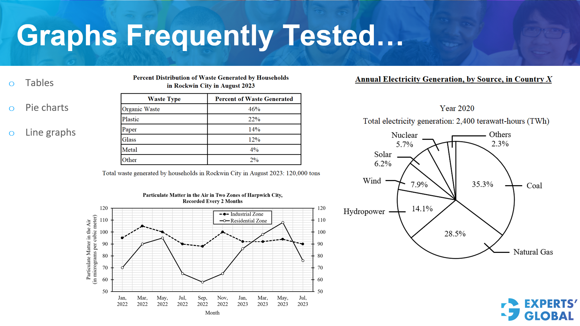
Three of the common chart types in GRE data interpretation are tables, pie charts, and line graphs. A GRE data interpretation set may use one or two such displays as the primary source for the group of three quantitative questions.
A table presents data in rows and columns, allowing you to compare exact numerical values across categories or variables.
A pie chart shows how a whole is divided into parts, with each slice representing a proportion or percentage of the total.
A line graph displays how a quantity changes across an ordered scale, usually time, by connecting data points to show trends and patterns.
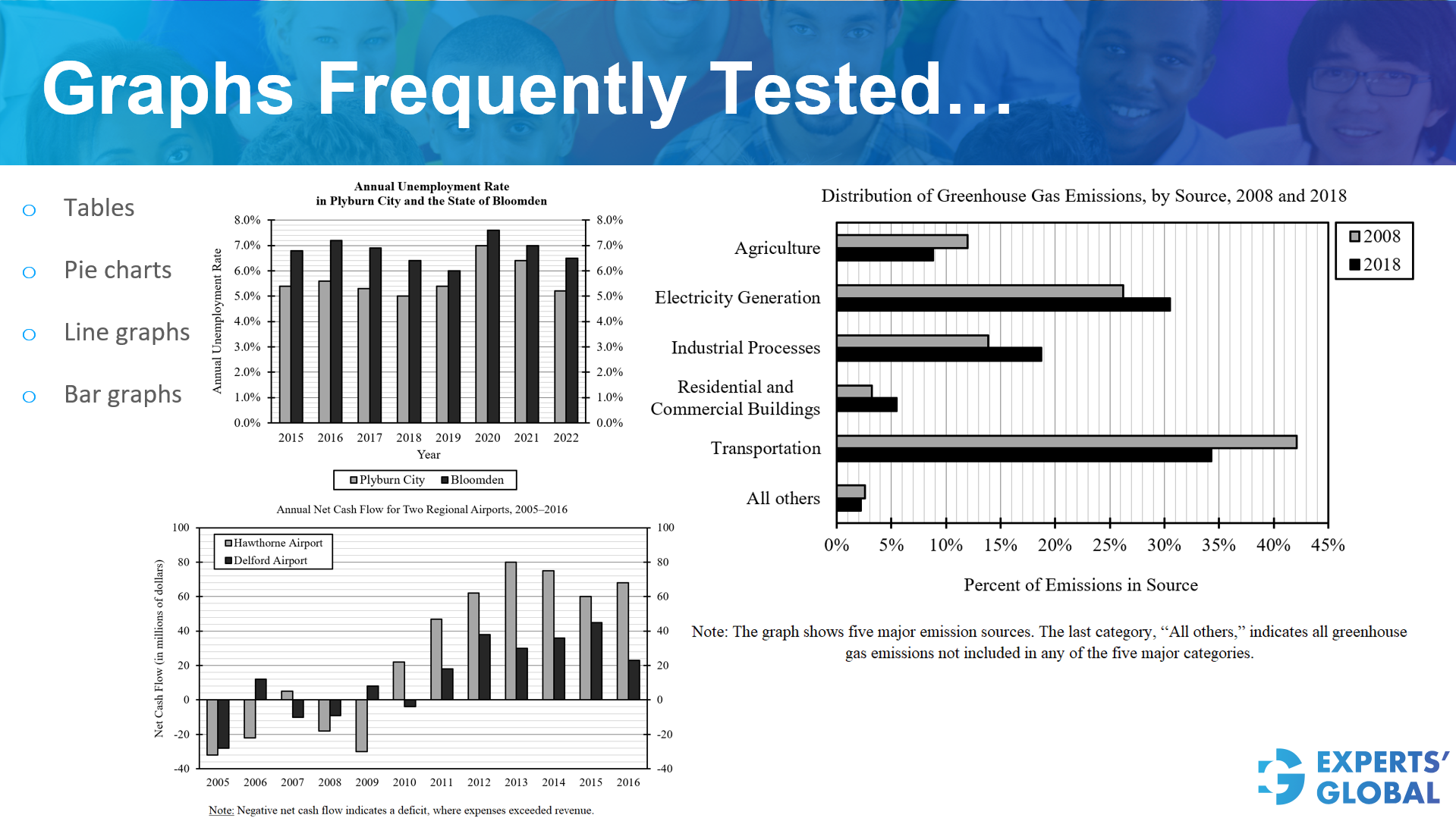
The next commonly tested chart type in GRE data interpretation is the bar graph, which appears in both horizontal and vertical orientations and may also include negative values. Get well versed with these commonly tested chart types and practice thoroughly through GRE drills, GRE sectional tests, and GRE mock tests.
A vertical bar graph displays categories along the horizontal axis and uses vertical bars to compare numerical values across categories.
A horizontal bar graph displays categories along the vertical axis and uses horizontal bars to compare their numerical values across categories.
Bar graphs with negative values show quantities that extend in opposite directions from zero, allowing direct comparison of positive and negative magnitudes across categories.
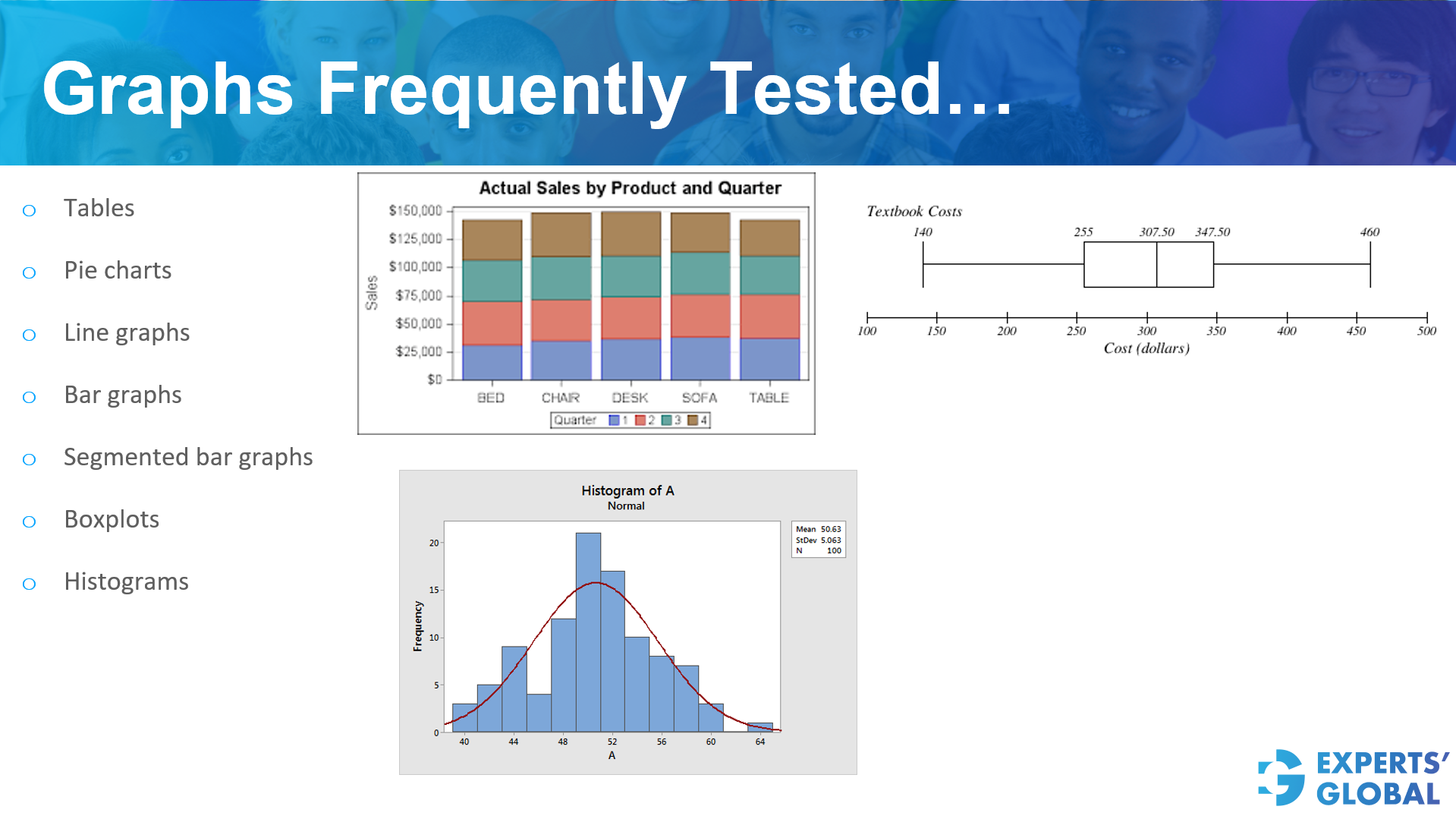
The next three commonly tested chart types in GRE data interpretation questions are segmented bar graphs, box plots, and histograms.
A segmented bar graph divides each bar into sub segments to show how a total splits across components while allowing comparison across categories.
A box plot summarizes the distribution of a data set using the minimum, lower quartile, median, upper quartile, and maximum, highlighting spread and central tendency.
A histogram groups numerical data into intervals and uses adjacent bars to show the frequency of values within each interval.
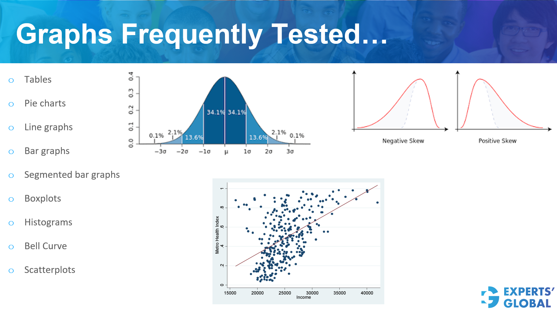
The next commonly tested chart types on GRE data interpretation questions are normal bell curves, skewed bell curves with positive or negative skew, and scatter plots.
A normal bell curve represents a symmetric distribution in which most values cluster around the mean and frequencies taper evenly on both sides.
A skewed bell curve represents an asymmetric distribution in which data cluster more on one side, with a longer tail extending toward higher values in positive skew or lower values in negative skew.
A scatter plot displays paired numerical data as points on a plane to show patterns, associations, or lack of association between two variables.
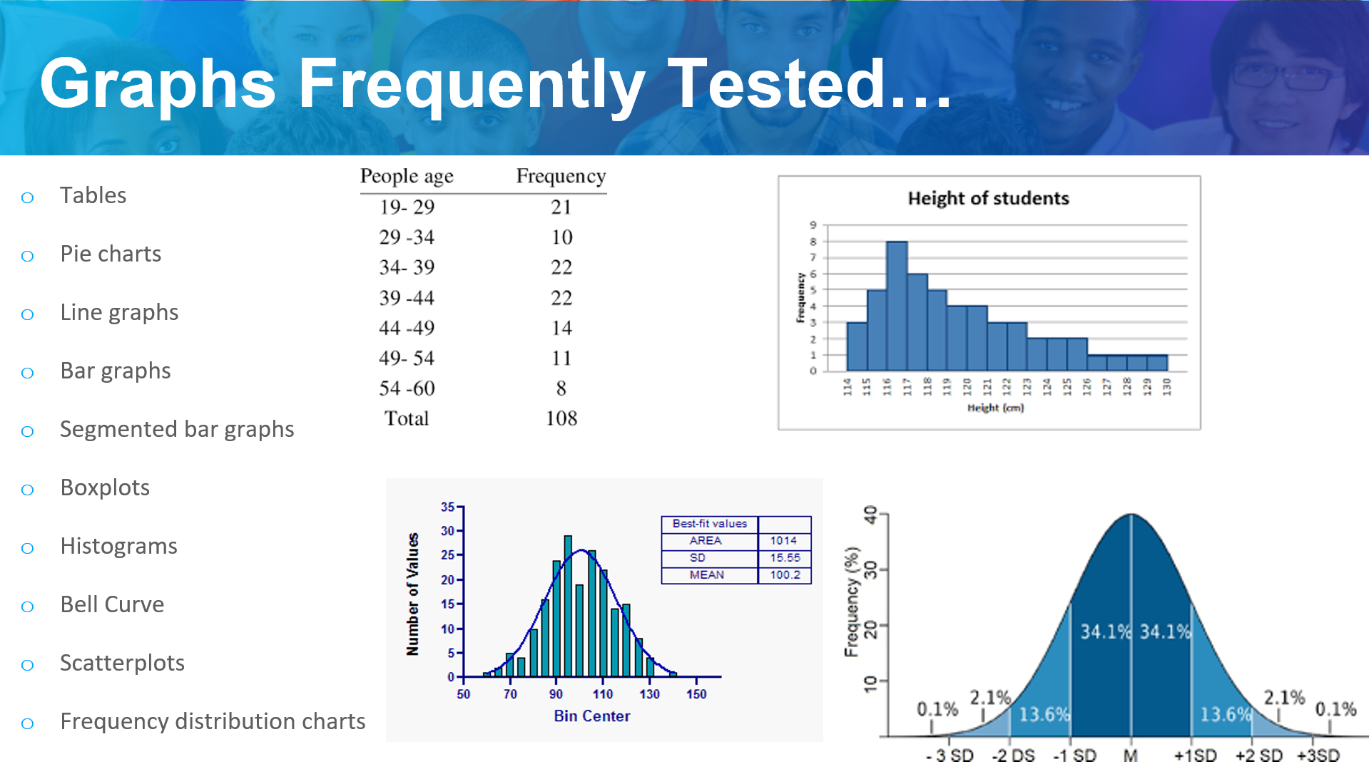
The next commonly tested chart type in GRE data interpretation is the frequency distribution chart, which may appear as a frequency table, a bar graph, a histogram, or a bell curve.
A frequency distribution chart organizes data into value ranges or categories and shows how often observations fall into each range, allowing you to study spread, clustering, and overall distribution patterns.
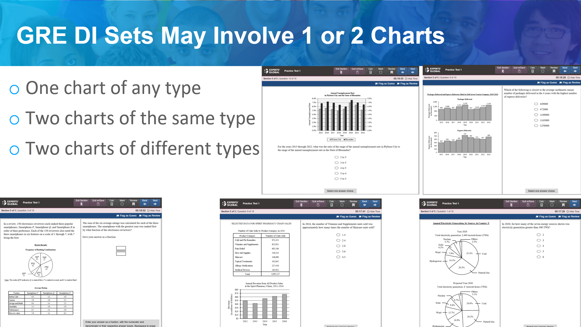
GRE Data Interpretation sets typically involve one or two charts. These sets may include:
The quantitative reasoning required for these sets often involves several types of data visualizations and mathematical operations:
Data Interpretation (DI) is essentially an extension of standard quantitative reasoning rather than a separate academic topic or unique question category. These questions function as general math problems where the primary difference lies in the delivery of information, which is provided through visual formats such as graphs, charts, and tables.
Mastering DI requires a strong foundation in core quantitative concepts combined with targeted practice. Success in this area depends on:
GRE prep course with 7-day free trial
15 full length GRE practice tests
60 sectional GRE practice tests
