
Invest 30 seconds...
...for what may lead to a life altering association!
Help Line
- +91.8800.2828.00 (IND)
- 1030-1830 Hrs IST, Mon-Sat
- support@expertsglobal.com
33% off ends soon:GMAT/GRE prep + applications bundle. Profile building, longer mentoring, better results. Inquire
GRE Data Interpretation sets frequently draw from a well defined group of quantitative concepts. These include ratio, percentage, percentage change, absolute change, average, median, range, standard deviation, highest or lowest value, less than or greater than comparisons, subset or superset relationships, and finding missing data. The following video, a part of our comprehensive GRE prep online course, explains these frequently tested concepts with clarity and shows how they appear on real GRE Data Interpretation sets.
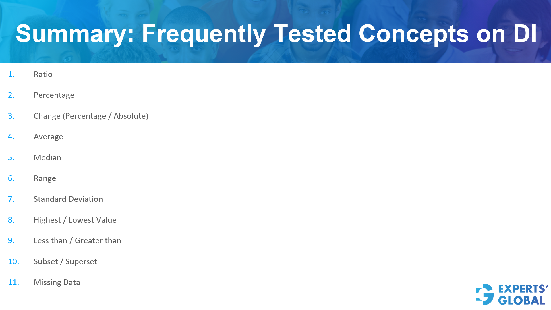
Frequently tested concepts in Data Interpretation (DI) involve a variety of mathematical and statistical principles used to analyze information. Key topics include:
Comparing values and expressing parts of a whole or changes over time.
Calculating both absolute changes (the direct difference between numbers) and percentage changes.
Determining the Average (arithmetic mean), Median (the middle value in a set), and Range (the difference between the highest and lowest values).
Measuring the amount of variation or dispersion in a set of values.
Identifying the Highest and Lowest values in a dataset, as well as performing “Less than” or “Greater than” comparisons.
Understanding the relationship between Subsets and Supersets.
Handling and solving for incomplete information within a dataset.
Correct Answer: B
For a detailed explanation, please refer to the video presented earlier on this page.
Following is a concise, step-wise written explanation…
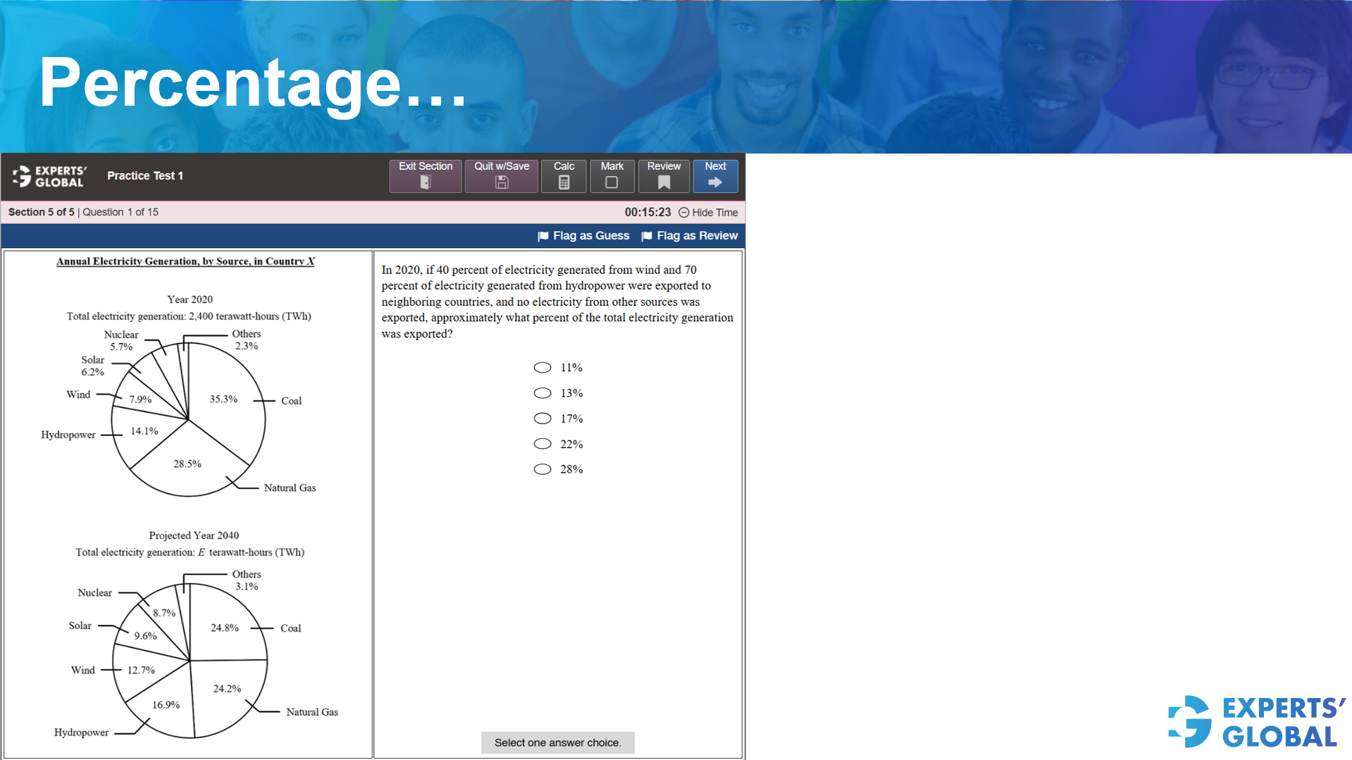
In 2020, if 40 percent of electricity generated from wind and 70 percent of electricity generated from hydropower were exported to neighboring countries, and no electricity from other sources was exported, approximately what percent of the total electricity generation was exported?
Look at the Year 2020 chart.
The question asks for the export relative to the total generation.
Add the two export percentages together because no other sources were exported.
13.03% is approximately 13%.
Correct Answer: B
Correct Answer: B
For a detailed explanation, please refer to the video presented earlier on this page.
Following is a concise, step-wise written explanation…
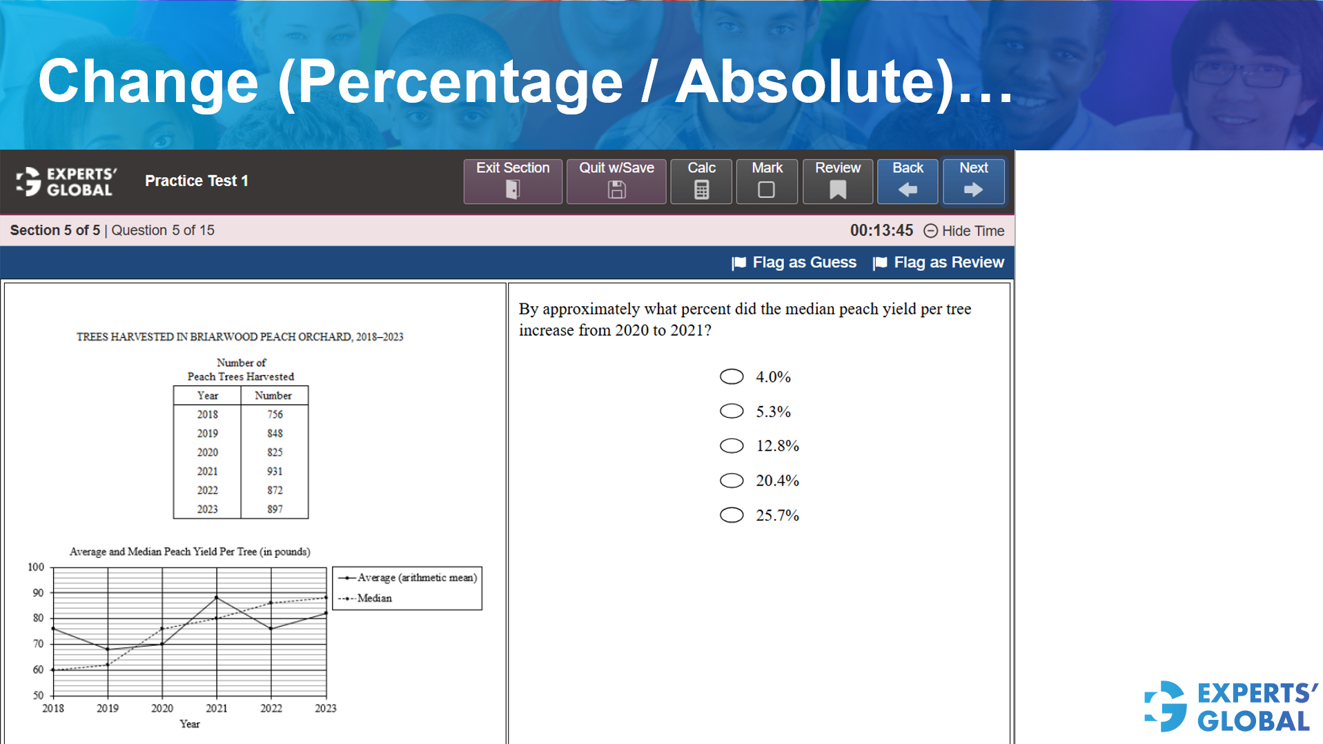
By approximately what percent did the median peach yield per tree increase from 2020 to 2021?
Look at the line graph titled Average and Median Peach Yield Per Tree. Locate the dashed line representing the Median.
Subtract the old value from the new value: 80 – 76= 4 pounds.
Divide the increase by the original 2020 value and multiply by 100:
(4 / 76) * 100
= approximately 5.3%
Correct Answer: B
Correct Answer: B
For a detailed explanation, please refer to the video presented earlier on this page.
Following is a concise, step-wise written explanation…
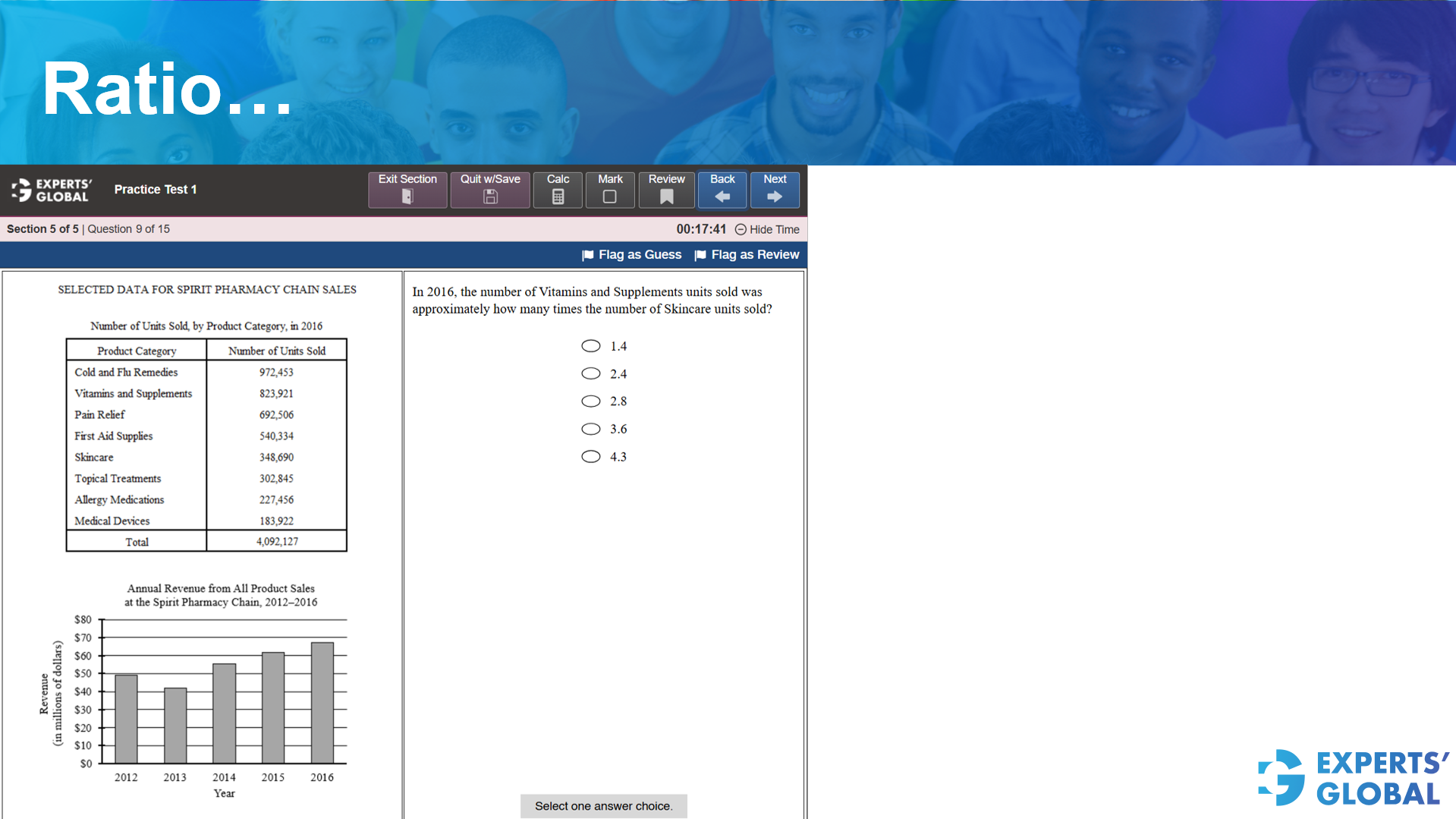
In 2016, the number of Vitamins and Supplements units sold was approximately how many times the number of Skincare units sold?
Look at the table provided in the image for the year 2016.
Since the question asks for an approximate value, round the numbers to make the calculation easier.
Divide the number of Vitamins and Supplements by the number of Skincare units. Ratio = 824,000 / 349,000
824 / 349 is roughly equal to 2.36.
Looking at the options, 2.36 rounds to 2.4.
Correct Answer: B
Correct Answer: B
For a detailed explanation, please refer to the video presented earlier on this page.
Following is a concise, step-wise written explanation…
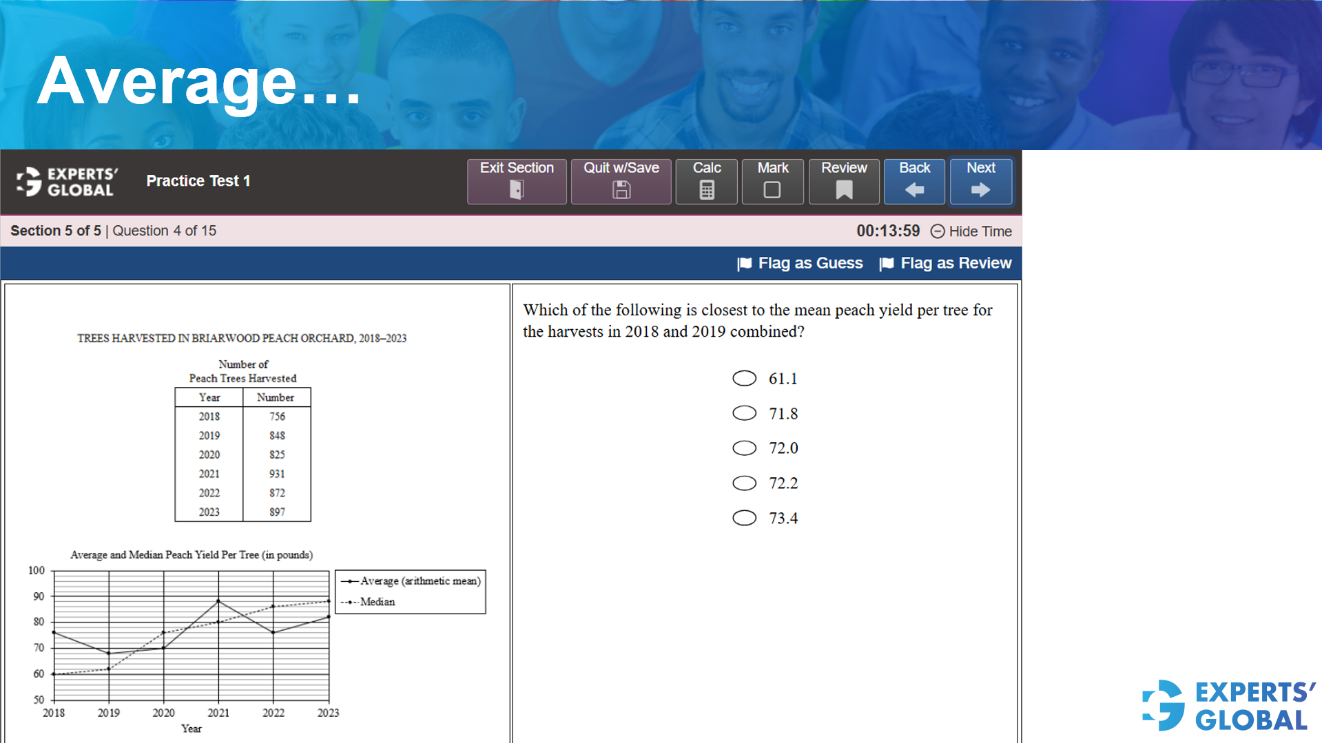
Which of the following is closest to the mean peach yield per tree for the harvests in 2018 and 2019 combined?
2018:
Average yield per tree = 76 lb
Trees harvested = 756
2019:
Average yield per tree = 68 lb
Trees harvested = 848
2018 total = 76 × 756 = 57,456 lb
2019 total = 68 × 848 = 57,664 lb
Combined mean yield per tree
= (57,456 + 57,664) ÷ (756 + 848)
≈ 71.8
Correct answer: B
Correct Answer: C
For a detailed explanation, please refer to the video presented earlier on this page.
Following is a concise, step-wise written explanation…
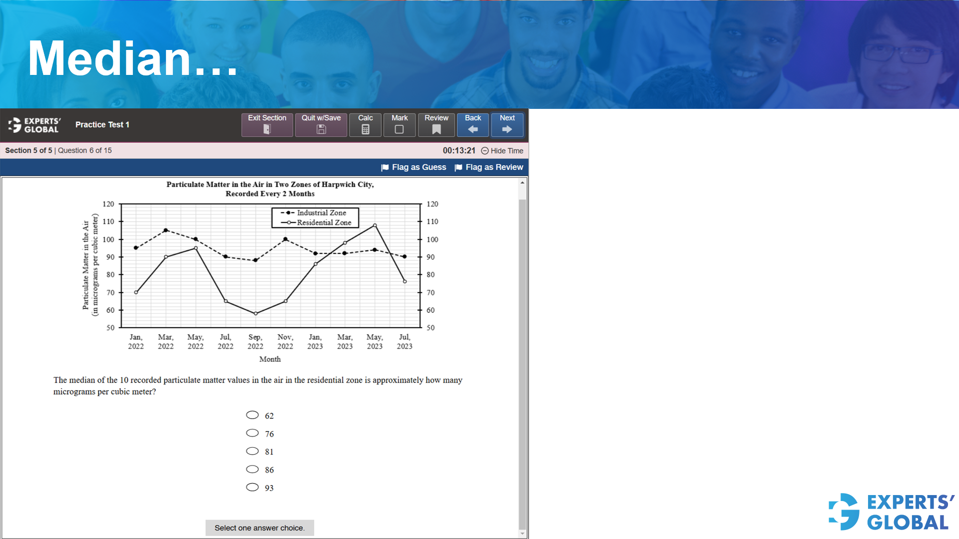
The median of the 10 recorded particulate matter values in the air in the residential zone is approximately how many micrograms per cubic meter?
There are 10 residential zone readings, so the median lies between the 5th and 6th values.
From the chart, the two middle values are approximately 76 and 86.
Median ≈ (76 + 86) / 2 = 81
Correct Answer: C
Correct Answer: D
For a detailed explanation, please refer to the video presented earlier on this page.
Following is a concise, step-wise written explanation…
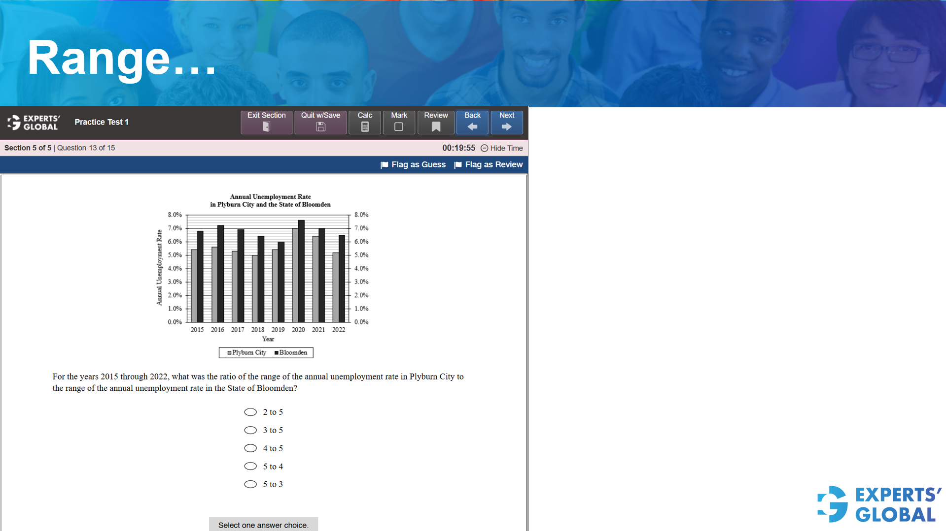
For the years 2015 through 2022, what was the ratio of the range of the annual unemployment rate in Plyburn City to the range of the annual unemployment rate in the State of Bloomden?
From the chart, Piyburn City ranges approximately from 5.0% to 7.0%.
Bloomden ranges approximately from 6.0% to 7.6%.
Range for Piyburn City ≈ 7.0% − 5.0% = 2.0%
Range for Bloomden ≈ 7.6% − 6.0% = 1.6%
Ratio = 2.0 : 1.6
2.0 : 1.6 = 20 : 16
= 5 : 4
Correct Answer: D
Correct Answer: E
For a detailed explanation, please refer to the video presented earlier on this page.
Following is a concise, step-wise written explanation…
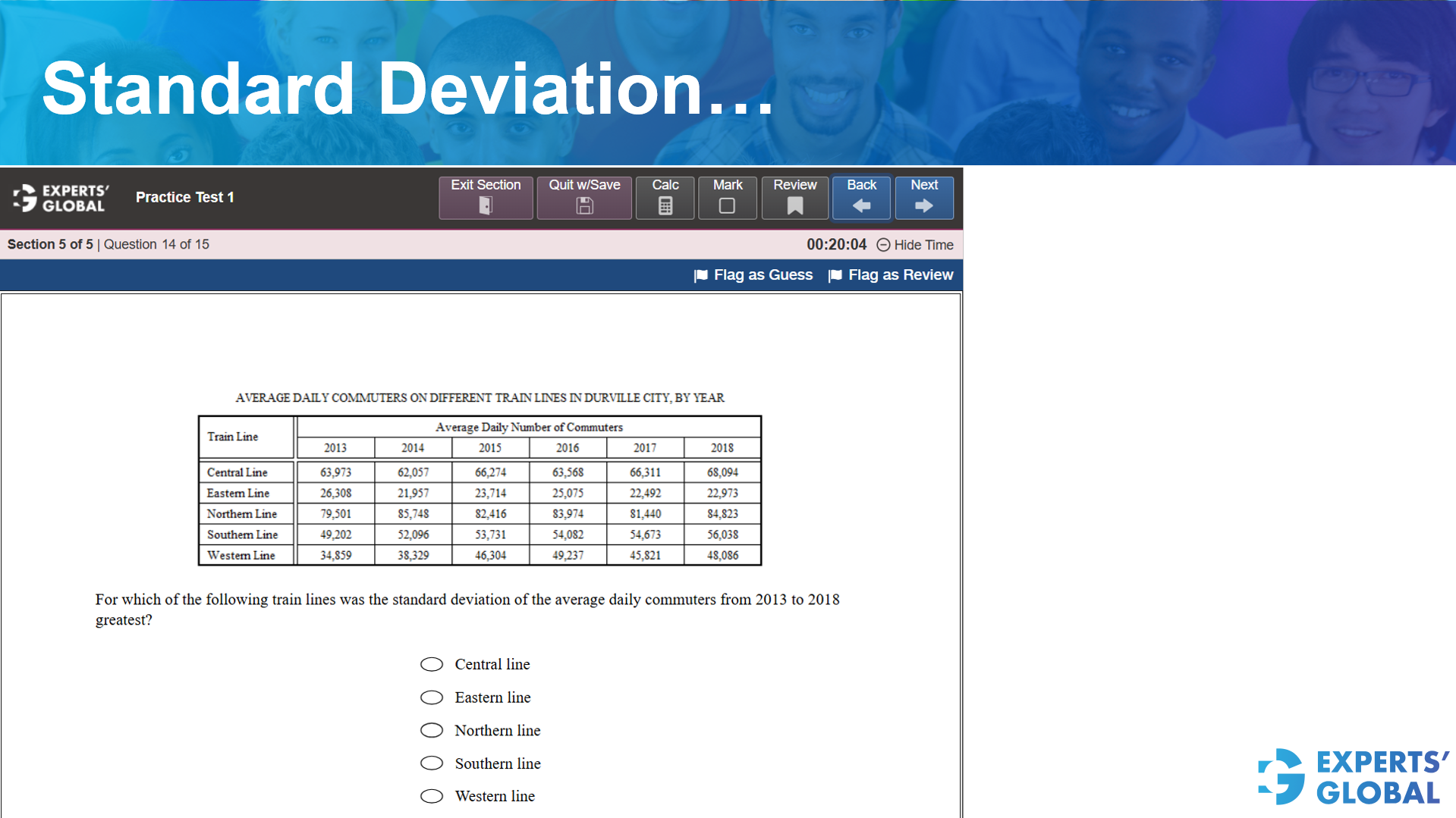
For which of the following train lines was the standard deviation of the average daily commuters from 2013 to 2018 greatest?
Standard deviation measures how spread out the numbers are from their average. To find the greatest standard deviation without complex math, look for the row with the largest difference between its highest and lowest values (the range).
The Western Line shows the most significant fluctuations over the six year period. Because the data points for the Western Line are much more spread out than the others, it has the greatest standard deviation.
Correct Answer: E
Correct Answer: C
For a detailed explanation, please refer to the video presented earlier on this page.
Following is a concise, step-wise written explanation…
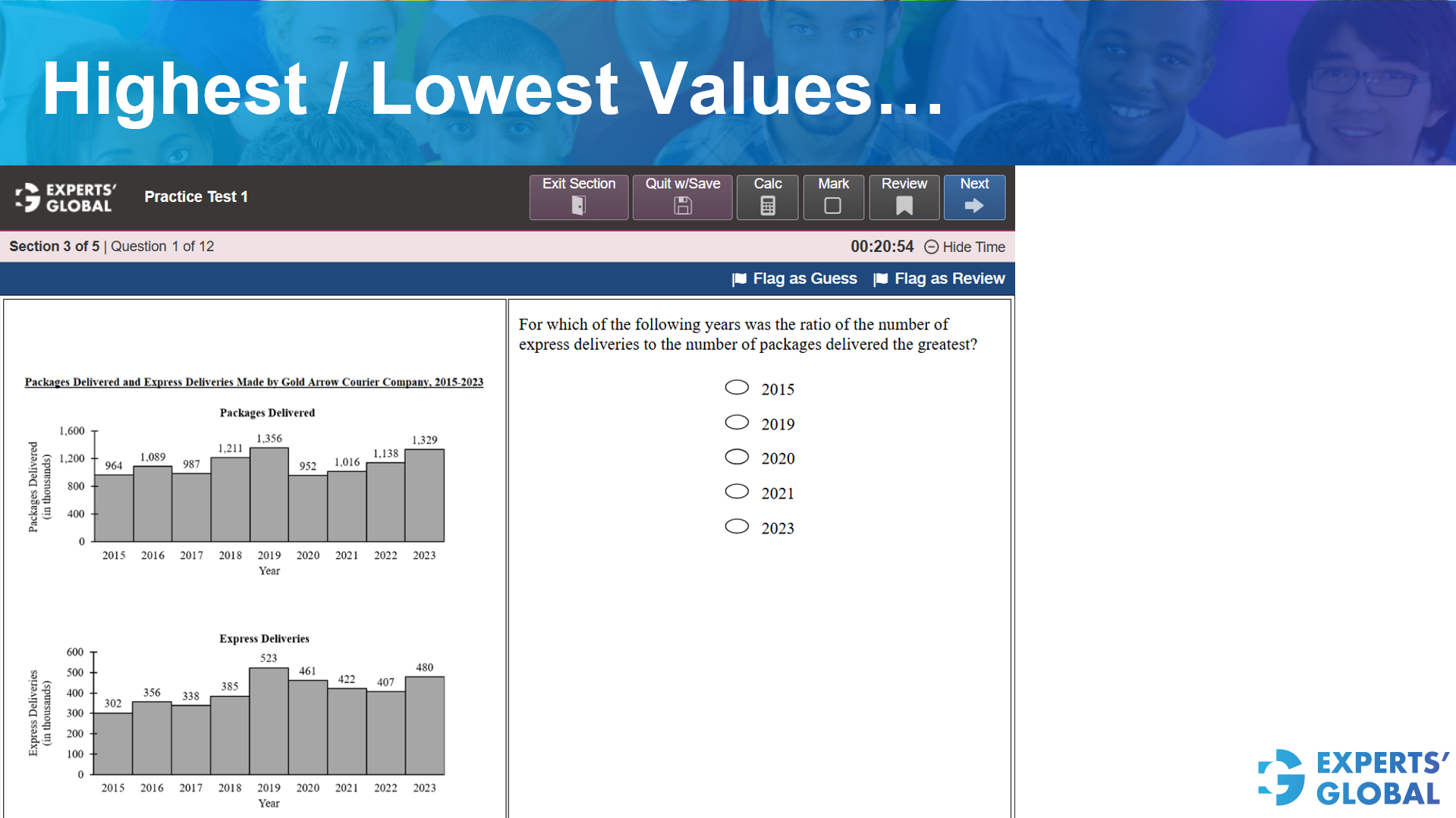
For which of the following years was the ratio of the number of express deliveries to the number of packages delivered the greatest?
For each year in the choices, find the value from the Express Deliveries chart and the Packages Delivered chart.
Look for the year where the top number is the largest part of the bottom number.
The year 2020 has a numerator that is nearly half of its denominator.
In all other years, the express deliveries are much less than half of the total packages.
Therefore, the ratio for 2020 is the highest.
Correct Answer: C
Correct Answer: E
For a detailed explanation, please refer to the video presented earlier on this page.
Following is a concise, step-wise written explanation…
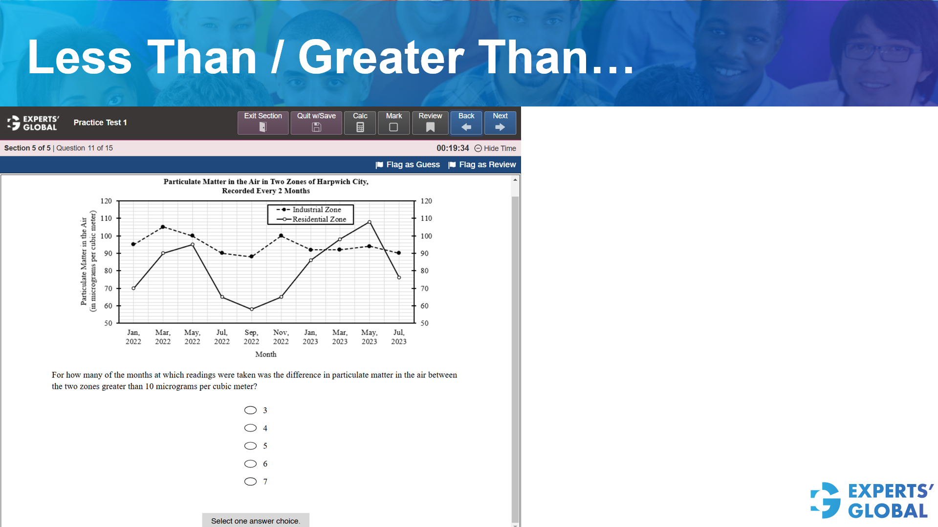
For how many of the months at which readings were taken was the difference in particulate matter in the air between the two zones greater than 10 micrograms per cubic meter?
The question asks to count the number of months where the gap between the Industrial Zone line and the Residential Zone line is more than 10 units on the vertical axis.
Each horizontal line on the vertical axis represents an increment of 10 micrograms. Therefore, a difference greater than 10 means the two points must be separated by more than one full grid square vertically.
There are 7 months where the difference is greater than 10.
Correct Answer: E
Correct Answer: A
For a detailed explanation, please refer to the video presented earlier on this page.
Following is a concise, step-wise written explanation…
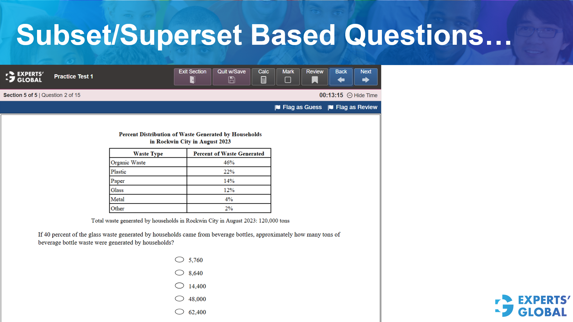
Total waste generated by households in Rockwin City in August 2023: 120,000 tons.
If 40 percent of the glass waste generated by households came from beverage bottles, approximately how many tons of beverage bottle waste were generated by households?
The table shows that Glass is 12 percent of the total waste.
Total Glass = 12 percent of 120,000
Total Glass = 0.12 * 120,000 = 14,400 tons.
The question states that beverage bottles make up 40 percent of the glass waste.
Bottle Waste = 40 percent of 14,400
Bottle Waste = 0.40 * 14,400 = 5,760 tons.
Correct Answer: A
Correct Answer: B
For a detailed explanation, please refer to the video presented earlier on this page.
Following is a concise, step-wise written explanation…
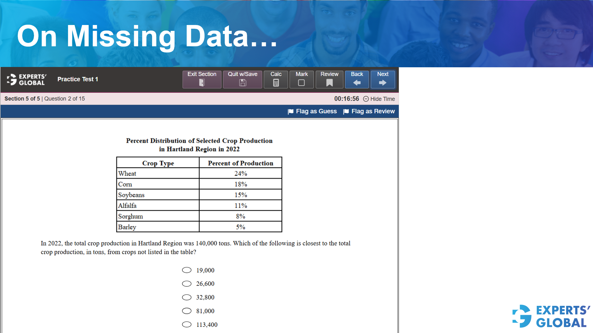
In 2022, the total crop production in Hartland Region was 140,000 tons. Which of the following is closest to the total crop production, in tons, from crops not listed in the table?
Add all the percentages given in the table: 24 percent + 18 percent + 15 percent + 11 percent + 8 percent + 5 percent = 81 percent.
Subtract the total listed percentage from 100 percent: 100 percent – 81 percent = 19 percent.
Multiply the total production by the unlisted percentage: 140,000 * 0.19 = 26,600.
Correct Answer: B
End to end online GRE preparation course with free trial
Free GRE full length diagnostic mock
Five-week focused GRE crash course
GRE prep plus graduate admission consulting
