
Invest 30 seconds...
...for what may lead to a life altering association!
Help Line
- +91.8800.2828.00 (IND)
- 1030-1830 Hrs IST, Mon-Sat
- support@expertsglobal.com
33% off ends soon:GMAT/GRE prep + applications bundle. Profile building, longer mentoring, better results. Inquire
Line diagrams provide a clear and structured way to represent overlapping sets by placing values along a single line. This format helps you sequence information smoothly, track shared elements accurately, and maintain correct totals throughout the setup. The approach supports layered GRE Quant questions that involve overlaps and combined counts.
The following video, part of our GRE preparation course, explains line diagrams for overlapping sets in a simple and structured manner. It shows how to build the diagram step by step, place values correctly, and update counts as information unfolds. The video then applies the method on GRE-style problems so you experience the application first-hand. Use this learning steadily across your GRE practice exercises and GRE sectional mocks, and GRE mocks.
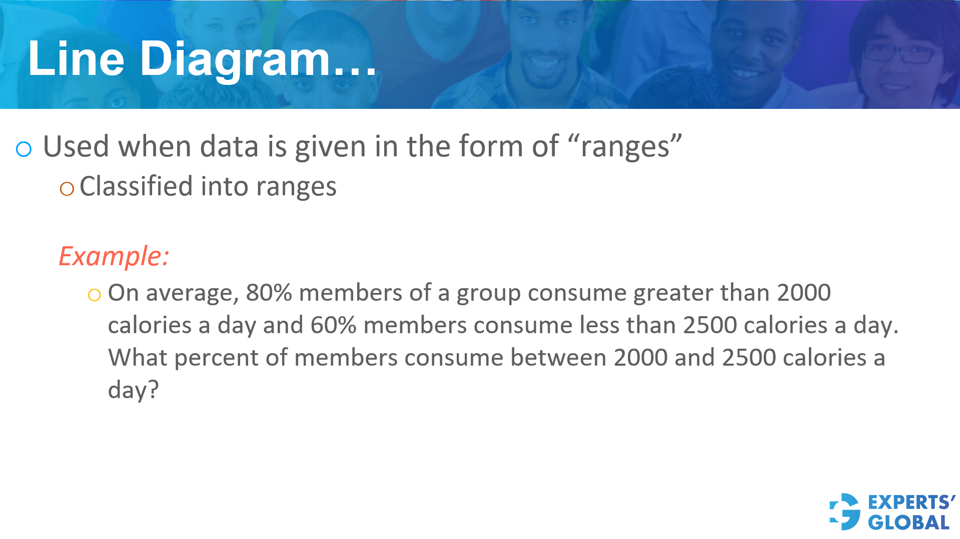
A line diagram is a tool used to analyze data presented as ranges. This method is particularly useful when data points are classified into specific numerical intervals.
Answer to the question on the slide is 40%
For a detailed explanation, please refer to the video presented earlier on this page.
For visual illustration, here is a snapshot from the video…

Following is a concise, step-wise written explanation…
On average, 80% members of a group consume greater than 2000 calories a day and 60% members consume less than 2500 calories a day. What percent of members consume between 2000 and 2500 calories a day?
Correct Answer: 40%
For a detailed explanation, please refer to the video presented earlier on this page.
For visual illustration, here is a snapshot from the video…
Following is a concise, step-wise written explanation…
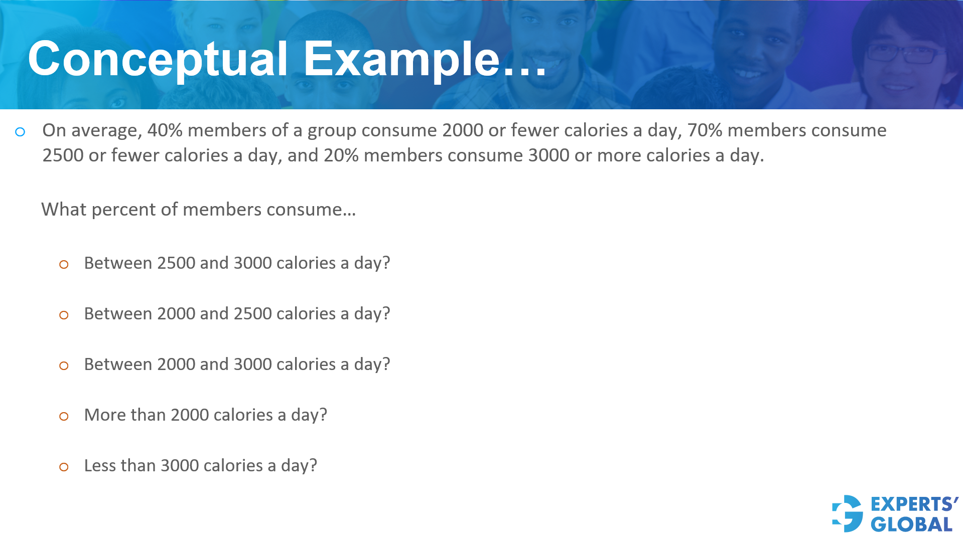
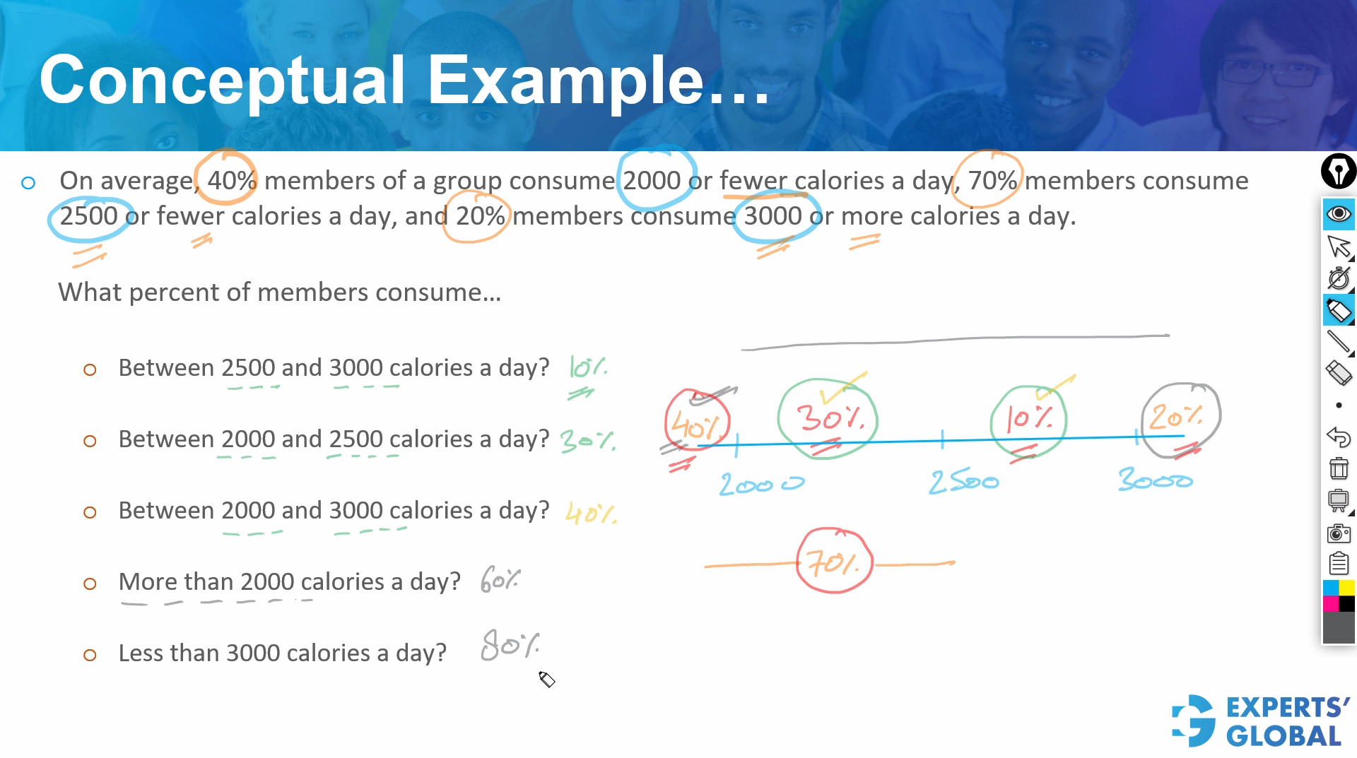
On average, 40 percent members of a group consume 2000 or fewer calories a day, 70 percent members consume 2500 or fewer calories a day, and 20 percent members consume 3000 or more calories a day.
What percent of members consume…
First, identify the percentage of people in each calorie range provided:
Correct Answer: 10 percent
Correct Answer: 30 percent
Correct Answer: 40 percent
Correct Answer: 60 percent
Correct Answer: 80 percent

When deciding how to represent overlapping sets of information, the choice between a Venn Diagram and a Line Diagram depends on whether the data is classified by categories or by numerical ranges.
For a detailed explanation, please refer to the video presented earlier on this page.
For visual illustration, here is a snapshot from the video…

Following is a written explanation…
Venn diagrams are the go-to tool when data is classified into distinct types or categories. This format is most effective when subjects can belong to one, both, or none of the specified groups.
Line diagrams are used when data is classified into ranges along a continuous scale. This is particularly useful for visualizing overlaps in numerical data, such as scores, ages, or timeframes.

Correct Answer: 30
Following is a concise, step-wise written explanation…
Of 150 students who appeared for a test, 105 scored below 80% and 75 scored above 60%. How many students scored more than 60% but less than 80%?
Find the number of students who scored 80% or more.
Total students = 150
Students below 80% = 105
Students who scored 80% or more = 150 – 105 = 45
Find the number of students who scored between 60% and 80%.
Total students who scored above 60% = 75
This group of 75 includes students between 60% and 80%, plus the 45 students who scored 80% or more.
Students between 60% and 80% = 75 – 45 = 30
Correct Answer: 30
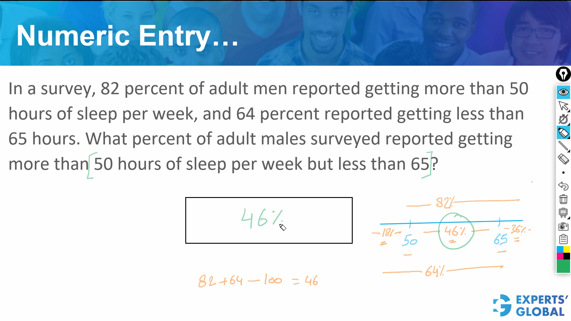
Correct Answer: 46
For a detailed explanation, please refer to the video presented earlier on this page.
For visual illustration, here is a snapshot from the video…
Following is a concise, step-wise written explanation…
In a survey, 82 percent of adult men reported getting more than 50 hours of sleep per week, and 64 percent reported getting less than 65 hours. What percent of adult males surveyed reported getting more than 50 hours of sleep per week but less than 65?
To solve this, we need to find the overlap between two groups of men. Let us look at the total population as 100 percent.
If we add these two percentages together: 82 + 64 = 146 percent.
Since the total number of people cannot exceed 100 percent, the amount over 100 percent represents the men who belong to both groups. These are the men who get more than 50 hours AND less than 65 hours.
146 – 100 = 46 percent.
If 82 percent are above 50 hours, then 18 percent must be at or below 50 hours.
If 64 percent are below 65 hours, then 36 percent must be at or above 65 hours.
To find the middle section (between 50 and 65), we subtract these two outside groups from the total: 100 – 18 – 36 = 46 percent.
Correct Answer: 46
GRE online preparation course with free trial
Free full length GRE diagnostic test
